Using Data Design to Ignite Engagement:
Transforming the BGOV200 Into a Digital Experience

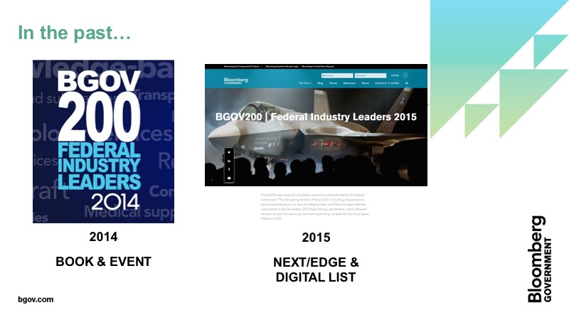
Data-driven & (now) all digital:
The BGOV200 is a ranking of the top 200 federal contractors based on prime contracts awarded. Here's how we rethought the experience.
The Solution
We reimagined the BGOV200 entirely. Instead of a live event, we created a highly interactive, visually immersive data visualization of the rankings. Knowing we had limited resources, we created a scalable digital experience, used Tableau to automate a 200+ page report and generated more leads, press mentions and Fortune 500 CEO engagement than ever before.
The Challenge
Rather than celebrating winners, the BGOV200 gala had become something of a loser. The annual event cost too much money with too little return. Many wanted to ditch it. My team saw an opportunity. We came up with a plan to rekindle the prestige of the BGOV200 brand and rescue a highly compelling dataset from being tossed in the dustbin.
Fast Facts
- My Role: Product Manager & UX Strategist
- Timeline: 3 months (launched June 2016)
- Teammates (a.k.a. Arms Twisted): Leads for Global Data + UX Design + Global Engineering
- Stakeholders: CEO Bloomberg Government + Head of Government Contracting Business
- Skills: Paper Prototyping, Sketch, Adobe Suite, InVision, Tableau
- Audience/Users: Government contractors doing $100M+ in federal business
- Data Sources: Federal Procurement Data System (FPDS) + BGOV Proprietary Data
Finished Product: BGOV200.com
Where we started:
What's old is new again

Rethinking a stale experience:
The 2014 BGOV200 gala. Rich content, expensive to host and almost no return on investment.
In years past, the BGOV200 had been a large gala. Winners were invited. Drinks and dinner were served. And a (not very engaging) panel discussion was hosted during dinner. For Bloomberg Government leadership, the event had become a burden. Clients loved it. But the event was bringing in few business leads--and even fewer sales. Following the Bloomberg Government rebrand, leadership thought it might be best to scrap it. As a product management and digital content leader, I rallied my team to see an opportunity.

Out with the old:
The old BGOV200 look and voice
→→→→→→→→→

In with the new:
A new visual language for the BGOV200
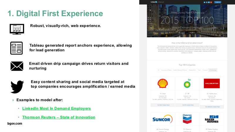
We knew the data was fantastic, with countless industry stories hidden deep in the dataset. Who was up? Who was down? Who had won a $300M+ contract to dispose of chicken carcasses related to the Avian Flu to get on the list for the first time (*cough* Clean Harbors Inc...under the hilariously euphemistic "facility-related services" category). Turning the BGOV200 around represented not only a potential storytelling bonanza, it represented a huge opportunity to show off our new brand (we had rebranded the entire company six months earlier), reintroduce the market to our data-driven SaaS solutions and, most exciting, we could make an immersive data visualization that would get people talking.
Making the case:
Pitching a marketing strategy rooted in data design
First, to make this idea a reality, we had to clear space. I'd served as product manager for digital and brand marketing during a huge company rebranding just a few months prior.
Translation: I'd recently used up a lot of resources (and political capital)...
So I needed to go back to the well and convince several business leaders that this was a worthwhile project with real business impact. We were also competing against the clock. I was trying to clear runway for this project in March and, if we couldn't launch by June, the data would be too old to make an impact. The government fiscal year ends Oct. 1 (weird, I know) and the data is published in March. Meaning, if we didn't clean and publish the data by June our competitors would get the drop on us. I threw together a quick (and very ugly) pitch deck and hit the road to sell the idea to various stakeholders.
The result? Resource concerns aside, almost everyone thought this was a promising business opportunity. I got approval to mobilize teams across Bloomberg globally to get this done. The strategy, in essence, looked like the following:

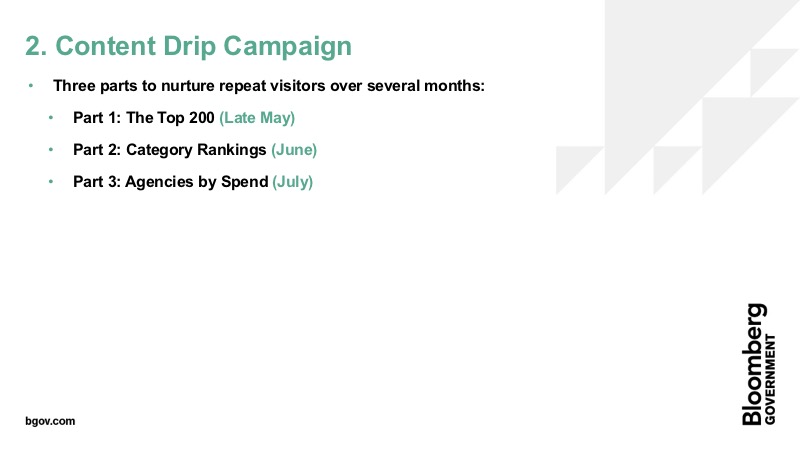
The data visualization would serve to entice downloads of the report, which serve to gather interest in a digital event about the report, which would encourage people to read blogs the PR team asked CEOs at the top 200 companies to write. Each asset would require different teams at different times--but first we needed to figure out the core of this new strategy: our data visualization.
Designing the new BGOV200:
Initial concepts & sketches
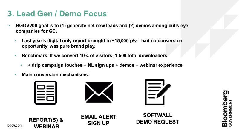
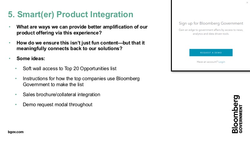
Initial ideas ranged in their ambition (e.g. series of smaller events? a webinar? just a report?), but I very clearly saw what this could and should be: interactive, immersive, and, frankly, badass (we're talking about fighter jets!). I wanted to turn the rankings into a digital experience that served as the gateway drug to a full, 200+ page report for contractors who really wanted to go in the weeds (and could hold the attention of reporters for earned media). For the audience that consumed the interactive, I wanted to earn the privilege of having them enter their data and downloading the report. The tradeoff: They become business leads. But in exchange they got high-quality, data-rich content and context on the state of their industry.

Sketchy business:
The team drew out lots of ideas and then hosted a crit with the data analysts and engineers to ensure feasibility and ease of development.
The UX and digital teams met to start sketching out what the experience would look like. We played around with lots of ideas for how to visualize the data but decided, ultimately, we needed to find a way to make the rankings really exciting. Make them standout. Give those not on the list FOMO and give those that made it something to celebrate, share and congratulate their teams on. We settled on making the company's the focus of the visualization rather than financial data itself.
Getting the job done:
The constantly shifting sands of data cleaning
My team and the data analysts worked hand in hand throughout the process. They'd parse the data and we'd create the vessel through which that data could come alive. But one of our biggest challenges was that the data kept changing. If you think simply ranking which companies received the most money in U.S. federal contracts is easy, you probably haven't dealt with federal databases before (aren't you lucky!). Let me introduce you to the primary source of our data, the Federal Procurement Data System - Next Generation (FPDS-NG):
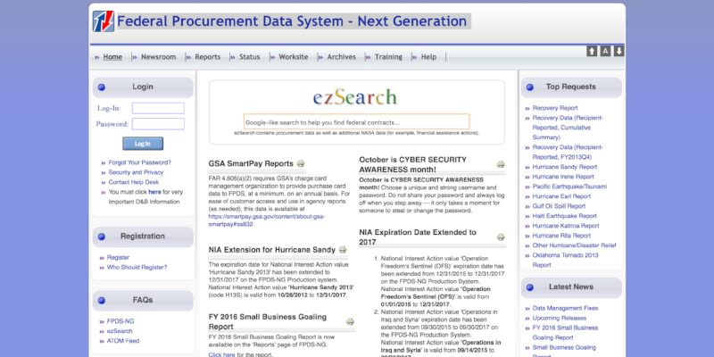
Meet your god:
FPDS-NG is the system for data on federal procurement. It's a pain, regularly amended...and our vessel for nearly all our raw data.
Just when we thought we had the list locked down, we'd get news: The FPDS data was technically, uh, yeah, hate to break it to you, wrong. Let's take an example: Say you factored in, for instance, the specifics of a merger and acquisition. Well, technically X company did grow by several billion last year, but the M&A activity didn't finish until after the fiscal year so, technically, that doesn't count for this year. A range of big and little changes peppered us throughout the final weeks.

When the rankings would shift, not only would we have to redo them in the data visualization (which was pretty easy to do, just needed to change the HTML), we'd also have to alert all the other teams that were affected. The team using an innovative trick in Tableau to automate the generation of the 200+ page report? Yeah, they'd need to rearrange the book...and redo the linked table of contents. The team contacting company CEOs to invite them to write blog posts about their tips for success in government contracting? Needed to make sure they weren't reaching out to anyone no longer on the list. It was, in short, a dynamic situation. But, two weeks before launch, we got the all clear from our lead data analyst. FPDS was locked in and no longer changing.
Avoiding information overload:
What not to show, interactive nav and (a fun foray into) resource brinksmanship
We spent a lot of time debating how to proceed from our sketches. With the data locked in, the digital team and UX teams collaborated to produce mid-fi wireframes. After collecting feedback on those, we scaled up to what the final visual design treatment would be. The blocks for each company would display, at a minimum, the company logo, their rank, their increase/decrease from the year prior, their corporate headquarters and total obligations. We also built into the requirements two interactive elements. A persistent right-rail navigation and a persistent filter system.

At first, we weren't sure if we'd be able to implement the navigation elements. While we'd initially considered doing the visualization in D3, we settled on building within the framework of the heavily modified Wordpress template we used regularly. When I visited with the engineering team to walk through requirements, they assured me the navigation elements would be easy enough to implement.
But, a week prior to launch the PM for engineering reached out. We would have to choose which interactive elements we wanted. They couldn't do the navigation features and the video hero element we'd requested. I knew technically these requests weren't hard. And, in my mind, all were essential to the user experience (and built into the requirements document from the beginning). Without the navigation, it would be almost impossible to navigate the site. If you wanted to see the 200th company you'd be scrolling for a while. And, the video hero was deeply important. That was our moment to greet the user with a kick in the pants! A way to say this isn't the same old boring government contracting data. They were both high priority. Long story short and a bit of negotiation later, we got word back: They'd prioritize building out all the elements for launch. Time to finish this thing off.
The final products:
An immersive data viz + an in-depth report + a savvy marketing campaign
While I can't provide specific performance metrics, I can share the following: When we launched, we witnessed the highest uptick in web traffic since our digital and corporate rebrand six months prior. On day one, the report broke the record for most number of downloads in a single day on our site. And, long term, it became the most downloaded report we'd ever published. From a business standpoint, the sales team reported the digital experience was pivotal in their outreach, gave them deeper penetration into target companies and resulted in a big boost in sales over the next six months. But, more fundamentally, it showed how we as a team could do a dynamic, interactive data visualization in a smart way for the business. Next year's report should be publishing soon.